
ColorOS design boss says the next iteration won’t copy Apple’s Liquid Glass
ColorOS 17: Why Oppo is Skipping the Apple-Inspired Redesign
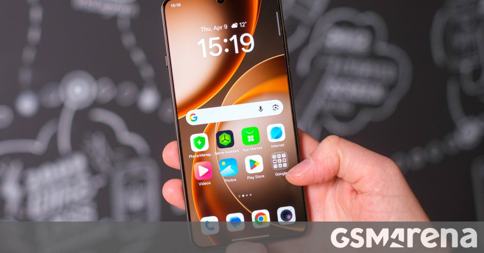
Remember those rumors about ColorOS 17 looking like a carbon copy of Apple’s Liquid Glass? It turns out we might want to temper those expectations. While early whispers from China suggested Oppo was leaning hard into the glossy, transparent aesthetic seen in recent iOS versions, the company’s design lead has just set the record straight.
Chen Xi, Oppo’s ColorOS design director, recently took to Weibo to clarify the roadmap for the next major update. According to him, ColorOS 17 isn’t interested in a massive visual overhaul. Instead, the team is doubling down on the basic user experience—prioritizing stability, speed, and overall refinement over flashy new skins.
Stability Over Style?
This pivot toward the “basics” comes with a bit of a trade-off. Chen Xi mentioned that several new features are being postponed. It’s currently unclear if these additions will surface in a mid-cycle update like ColorOS 17.1 or 17.5, or if we’ll have to wait until ColorOS 18 makes its debut next year. This approach suggests Oppo is playing the long game, focusing on a bug-free environment rather than chasing design trends just for the sake of looking fresh.
Keeping It Original
Interestingly, the design boss didn’t shy away from mentioning the competition. He acknowledged that while other manufacturers might be rushing to adopt an Apple-style Liquid Glass look, Oppo is intentionally carving its own path. For fans who were hoping for a more iOS-like experience on their Find or Reno series devices, this might be a bit of a letdown. However, for those who appreciate the current identity of ColorOS, it’s a sign of consistency.
What’s Your Take?
Are you a fan of the current ColorOS look, or were you hoping for a major design shift? Does a focus on performance and stability make up for a lack of visual updates? Let us know what you want to see in the next version of Oppo’s software in the comments below.